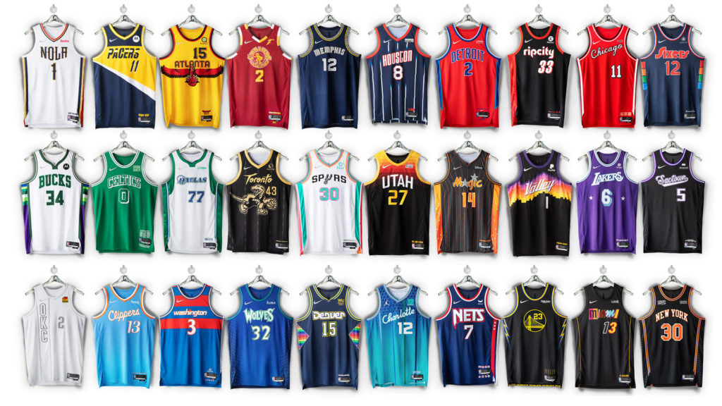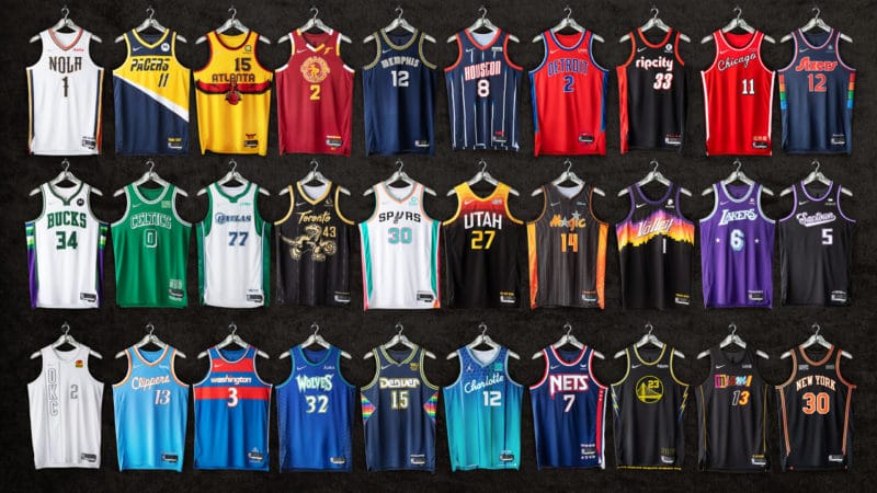
The new NBA City Edition jerseys are out and we’re all excited how the teams and the league will look to execute them on the court moving forward. Chris had this to say about them:
“Surprisingly, I like the majority of the new uniforms. I love the compilation style that they went for. Each small detail and trope points towards franchise history in a unique way — almost like a ‘What The…’ version of a sneaker but on the uniforms instead.”
Evan also put it nicely when he wrote, “There were some really cool jerseys unveiled this year. Being the 75th anniversary of the league, the jerseys looked to condense their franchises history into the design and come up with a fresh, cohesive look that evoked the teams’ storied past. No easy feat. And for me that is what makes one of these jerseys great. They need to feel sort-of retro but at the same time like they could be the team’s alternate jersey for the year and no one would bat an eye.”
However, not all jerseys have been created equal. There are some that standout for good reasons and others that are more infamous than anything. Take a look at the list below to see what our Weartesters team thinks of the new uniforms.
Last updated 11.18.2021
Best NBA City Edition Jerseys
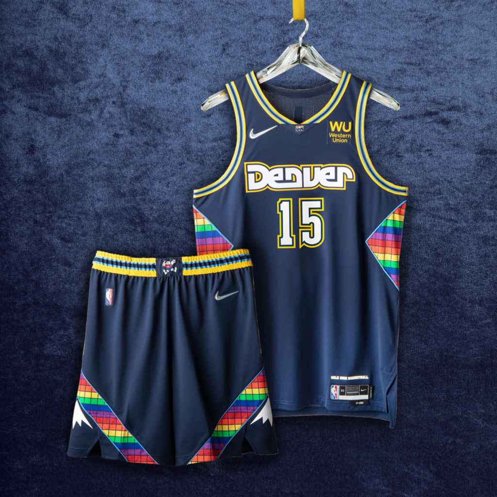
Denver Nuggets
We all remember prime Carmelo Anthony in Denver. Absolutely unstoppable. Pure scoring at its finest. And the Denver Nuggets’ NBA City Edition jersey reminds us of that time very well with the baby blue and gold trims. They also feature the classic rainbow, now featured on the sides rather than on the mountain silhouette. They kept the overall color of the jersey current, but gave the number and letter fonts a twist.
Jalique said of this jersey, “Another set that combines the most fun parts of the Nuggets uniform history, but everything blends together well. I’m glad they found something different to do with the rainbow skylines, and the way they set off that Melo-era baby blue and gold trim? Chef’s kiss.” Drew added, “I love the multicolor hints, stained glass window side panels and the color scheme.”
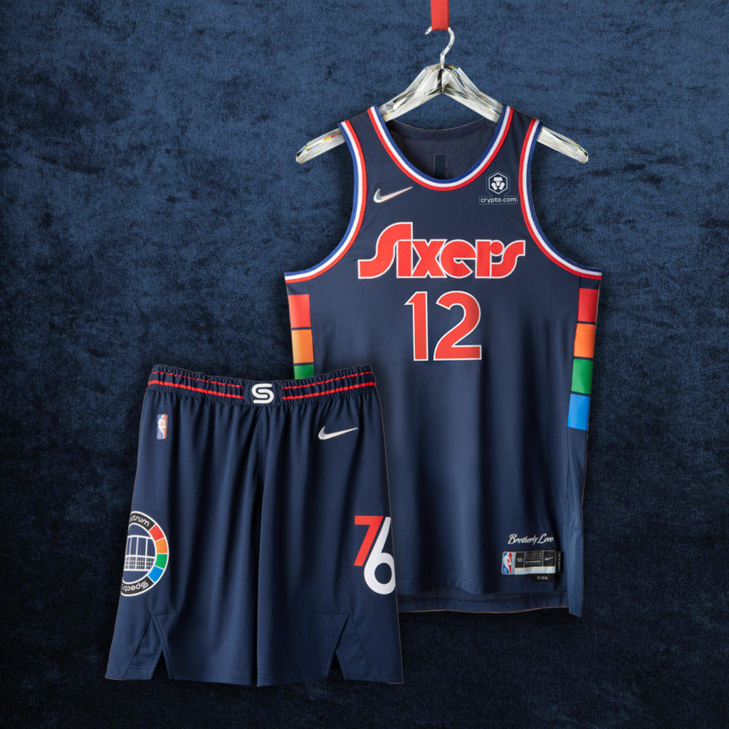
Philadelphia 76ers
The Philadelphia 76ers have had a colorful history and their new NBA City Edition jersey tries to pay tribute to that. The side panels reference the old Spectrum Center court graphic, and while the font they used hasn’t been used before, it still has the old school vibe to it. The trims on the edges remind us of Dr. J’s title run for the franchise in 1983. These are just plain clean and we couldn’t wait to see them live.
Drew had this to say, “I love the side panels and the fonts. The blue is a little drab but is a nice switch up from the typical red, white and blue 76ers theme. It’ll be a fun one to see on court.” Evan adds, “The uniform is sleek and subtle. The iconic gradient on the side panels fits perfectly within the design, the old school lettering, the red white and blue piping… this uni just does it for me.”
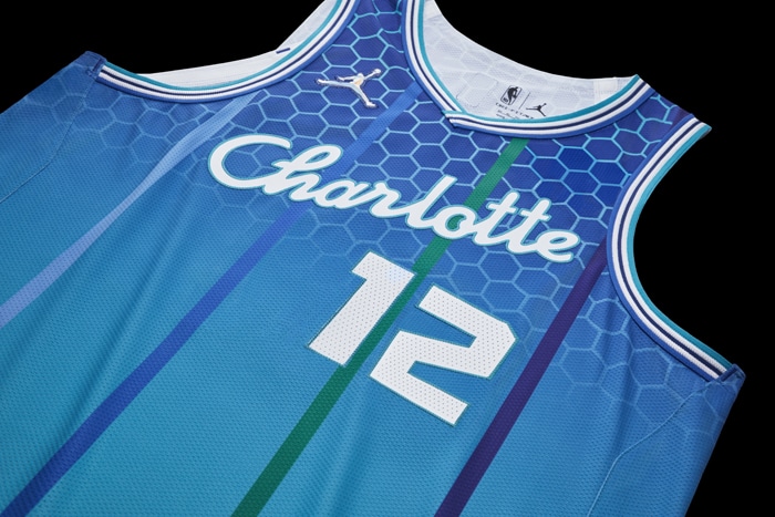
Charlotte Hornets
The Charlotte Hornets’ NBA City Edition uniform was the most liked by our contributors. On the top half, it features the very recognizable honeycomb pattern which eventually gradients into the classic color of the team. Overlaying that are some pinstripes taken from the the 90’s team jerseys. Somehow, this uniform makes us feel nostalgic, but also modern, which is a difficult combination.
Drew had this to say about it, “Wow. Just awesome. The thick honeycomb pattern on the shoulders reminds me of some of the best Oregon Duck jerseys. I like how it transitions both the thickness of the honeycomb and the color while adding the pinstripes from those classic 90s Hornets uniforms. An all-around winner of a design.” And Jalique had similar sentiments: “Admittedly I’m a little biased here, but can you blame me? I’m actually a harsher critic than most I’ve seen as I worry there may be too much going on with these unis, but I also can’t deny Charlotte did well combining some of the most fun elements of the franchise together. There’s even some subtle nods to the Bobcats era, but no need to get in depth with that…”
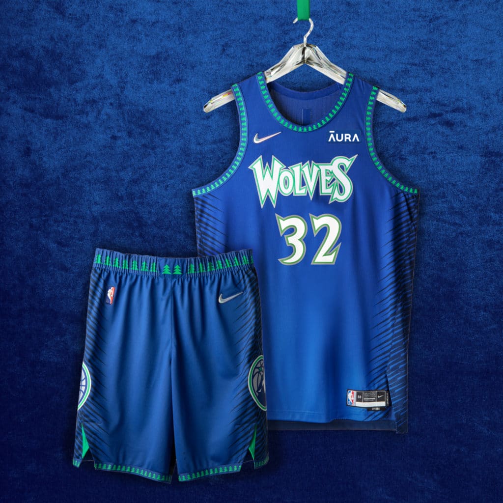
Minnesota Timberwolves
The Nike LeBron 18 is a solid option, despite some of the negatives We feel like we’re about to see prime Kevin Garnett on the court with the Minnesota Timberwolves’ new NBA City Edition uniforms. It sports the classic “Wolves” font which was what the Big Ticket was wearing when he was an MVP in 2003. They even have the classic outline and added some black stripes on the side for extra flare. The blue is the closest blue to the classic one they used back in the day.
Jalique was happy with the design: “I love that even though the T-Wolves (I feel so old saying that) city edition is indeed an amalgam, it looks the least like one. The brighter hues are also a nice in-between of their Icon/Association kits and the ultra bright Statement edition.”
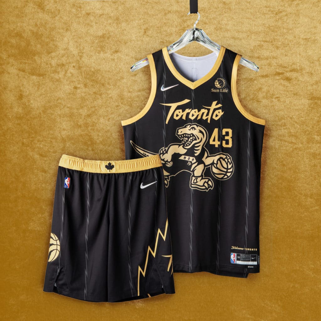
Toronto Raptors
The Toronto Raptors not only carries a city, but a country. No other NBA team can say that. And their NBA City Edition jerseys remind us of a golden era. They literally have gold outlining and coloring almost all of the design on the dominantly black base, which also takes inspiration from Drake’s OVO, the rapper being the team’s global ambassador. They even brought back the unmistakable cartoon Raptor dribbling a basketball, as well as the first font they used. This time, however, the dinosaur is wearing their most recent uniform with “North” spelled out. Stripes finish the look to give us that classic early 2000s vibe.
Stanley T. had this to say, “the RAPTOR itself is wearing the modern jersey – worn the year they won the first championship. Really nice details.”
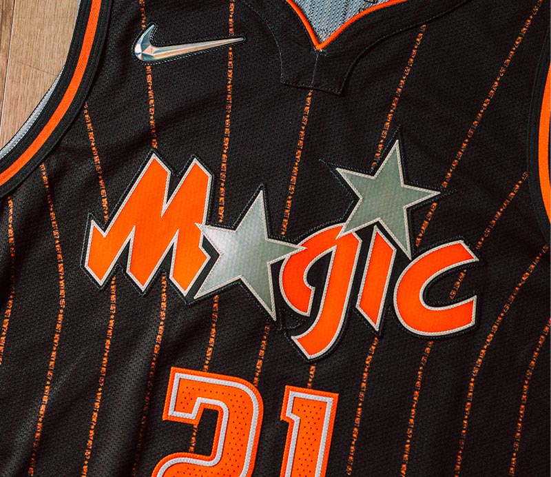
Orlando Magic
Admittedly, the Orlando Magic’s NBA City edition uniforms aren’t magical and out of this world, but they’re still very clean. We have the orange hits that cover a dark gray background and the classic “Magic” font and lettering from the Tracy McGrady days. And, of course, who can forget the pinstripes that were used in the 90s during the Shaq and Penny era, and brought back in modern form in 2008 for the last four years of the Dwight Howard era.
Drew said of the design, “They continue their Orange theme (there’s a ton of citrus grown in and around Orlando) but went with a more classic Magic design. It’s definitely an improvement from last year’s City Edition.”
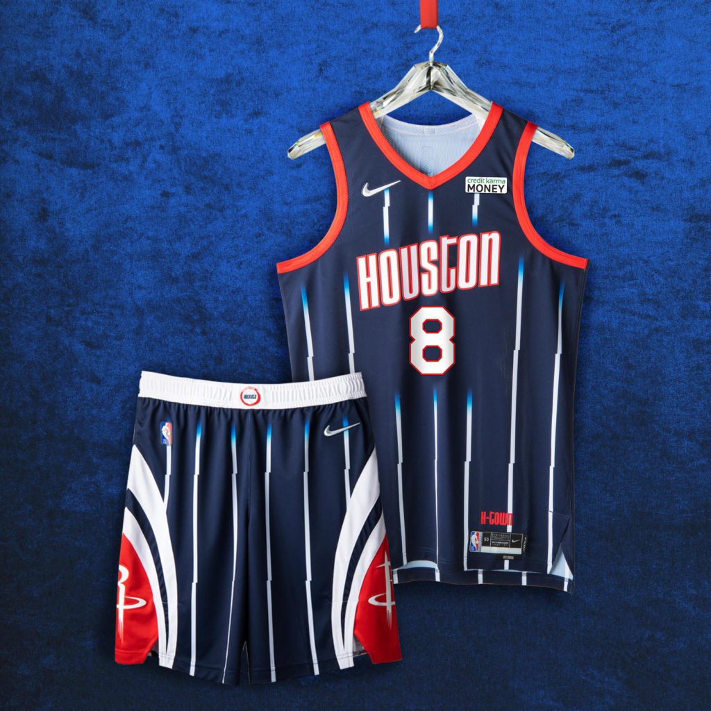
Houston Rockets
Pinstripes were really the thing back then and the Houston Rockets’ NBA City Edition uniform just adds to that list. The design helps us all remember the Yao Ming days, the first time a dominant player of Asian descent entered the league. An older font, the one used during the Hakeem Olajuwan era, was the choice here, which I think was a good pick. The red outline really finished the look, as well as the broken stripes.
NBA City Edition Jerseys with Potential
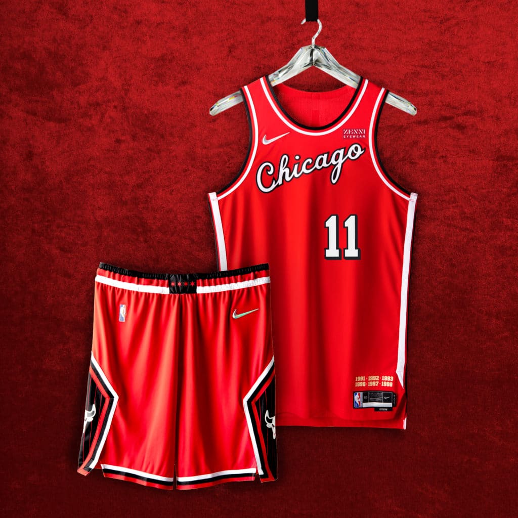
Chicago Bulls
The Chicago Bulls’ NBA City Edition uniforms interestingly pay homage to the 80’s, not the 90’s where Michael Jordan and Scottie Pippen absolutely put the league on a championship lockdown. The jersey overall resembles more the early Jordan era with the white stripes and the cursive “Chicago” lettering. Though these are nice and clean and the 80’s weren’t a terrible era for the Bulls, they could have paid more tribute to the dominance of the 90’s. But still, these are clean.
Brooklyn Nets
Some of us are old enough to remember that the Brooklyn Nets were originally the New Jersey Nets, and it’s nice to see that they have chosen not to bury that era with their new NBA City Edition uniforms. In fact, most of it actually looks like their alternate uniforms from the 90’s – from the lettering to the borders to the base color.
Evan wasn’t shy about how he felt about these: “I started watching NBA games on a regular basis right when J Kidd and KMart were dominating the Eastern Conference and this jersey immediately took me back to that era. Upon further inspection, you get hits of those 90’s jerseys that players like Kenny Anderson, Derrick Coleman and Petrovic popularized. I just love this jersey”
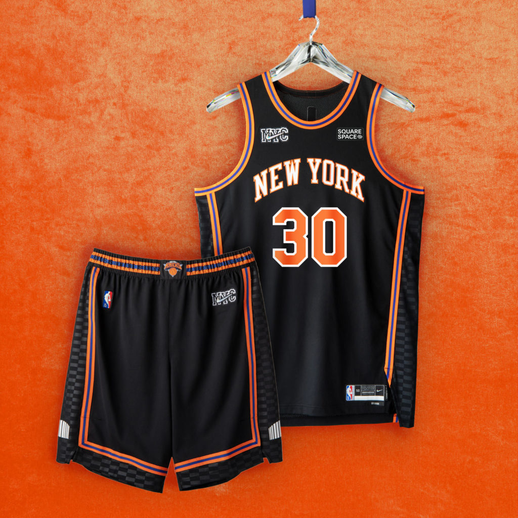
New York Knicks
This one is a sleeper since it looks simple. The New York Knicks’ NBA City Edition uniform features a predominantly black upper that has the classic orange and blue outline and stripes from the early 2010’s. Being the first franchise in NBA history is a great honor, and the Knicks have stayed true to their colors for the most part. This year is no different: classic orange and black with the famous font. How can you go wrong?
Stanley T. said it best: “It’s simple, it’s slick.” However, I do feel like they could have gone an extra mile more for the design to be louder, just like New York is.
Worst NBA City Edition Jerseys
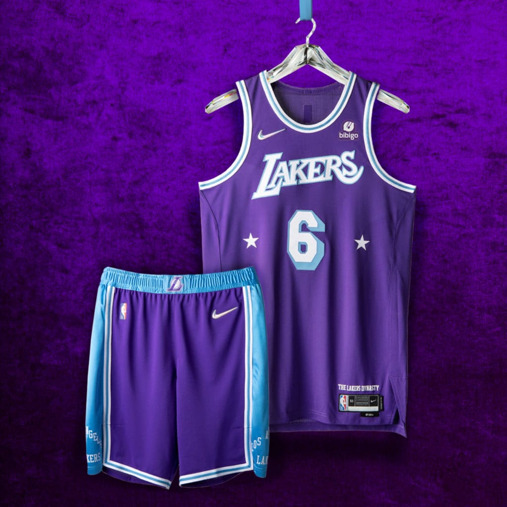
Los Angeles Lakers
This one is a sleeper since it looks simple. The Los Angeles Lakers are arguably the most storied franchise in basketball history, maybe even in sports. And they could have used a lot of that history with their new NBA City Edition uniforms. They did reference some, but not as much as we would have liked. The design sports a very purple upper with the classic “Lakers” lettering sideways with two stars near the number. The classic 60’s blue and white are also featured on the borders. What I feel is missing is the gold that has really become iconic and synonymous with the team.
Evan didn’t mince words when asked about this, though: “The Lakers’ design is lazy and ugly.”
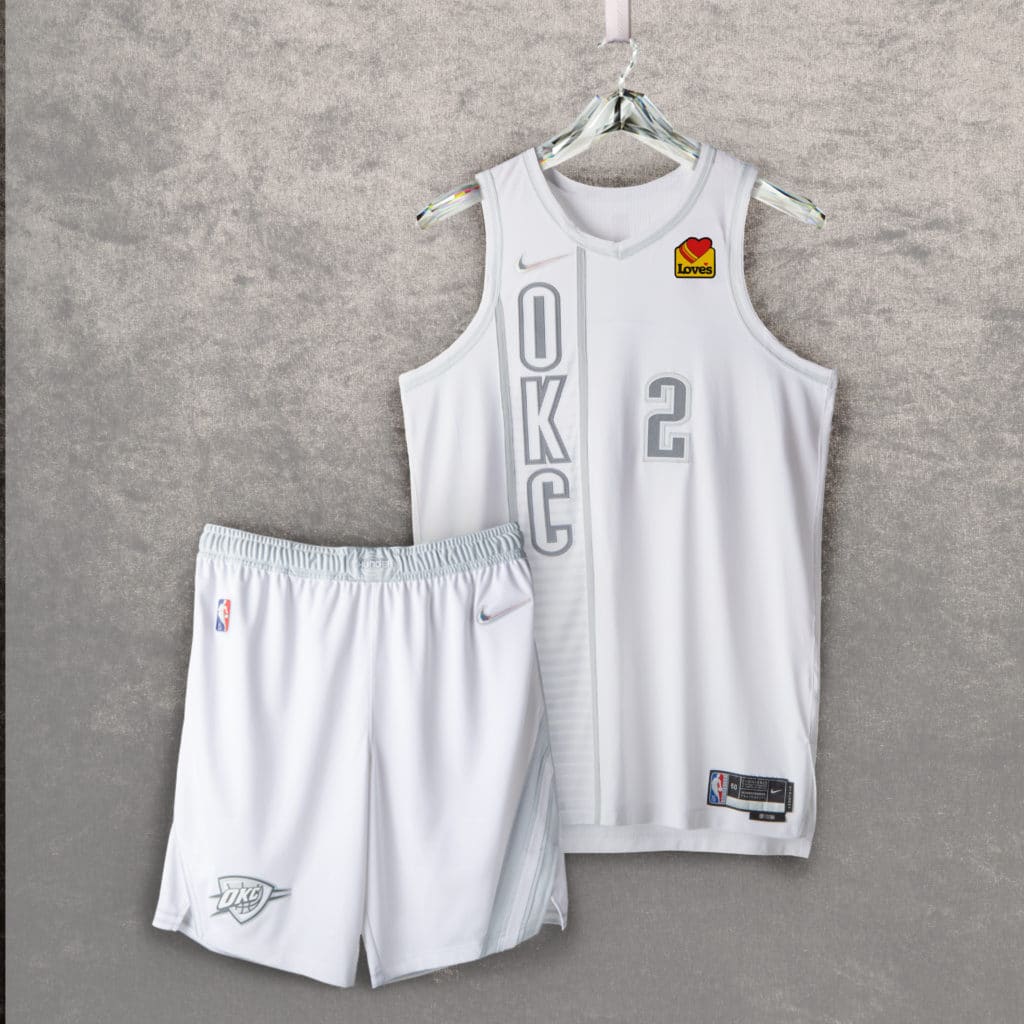
Oklahoma City Thunder
The Oklahoma City Thunder’s NBA City Edition uniforms have to be the plainest uniforms ever created in the NBA. It features the “OKC” lettering in dotted fashion on one side with the same style used for the number on the other side. Plus, the whole thing is just plain white, like stormtrooper armor. Honestly, their regular jerseys are more exciting than this special edition one.
Jalique put it this way: “Yikes.”
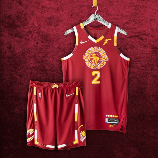
Cleveland Cavaliers
We don’t mean to add to the infamous quote from Joakim Noah about Cleveland, but the Cavaliers’ NBA City Edition uniforms just aren’t all that impressive. It features a logo which confusingly puts “Cavaliers” ahead of “Cleveland” and features an actual cavalier, facing backwards placed over a basketball. The multicolored hints do pay tribute to times past, but nothing is really exciting here.
Chris noted that this “one just doesn’t resonate with me.”
Conclusion
The NBA City Edition uniforms were a nice touch by the league. A lot of them really capture the era in which that team made its mark in NBA history, whether that be in the present or somewhere in the past. I think it can all give us a much deeper appreciation for not only how far the NBA has come, but basketball itself. Let us know in the comments what your favorite and least favorite jerseys are.