WearTesters provided you with a first look at the upcoming ‘Barons’ Air Jordan 13 Retro yesterday and today we have some additional images for you to take a look at.
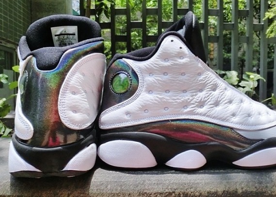
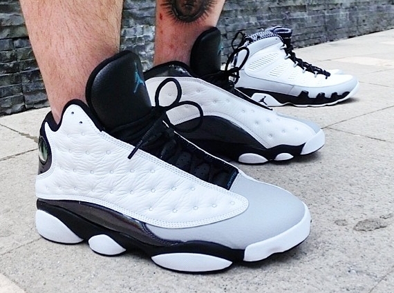
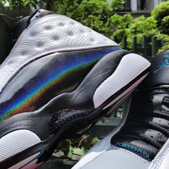
I’m surprised the 13 is getting the Baron treatment as it is but I’m even more surprised at how nice they are. The only thing I dislike is the weird holographic material that has replaced the typical suede. If they were to change that out to suede then I’d be more inclined to grab a pair, which is a shame since that wont happen, and these are one of the cleanest new colorways to be featured on the 13 in a long time.
Take a look at the latest images and feel free to share your thoughts below.

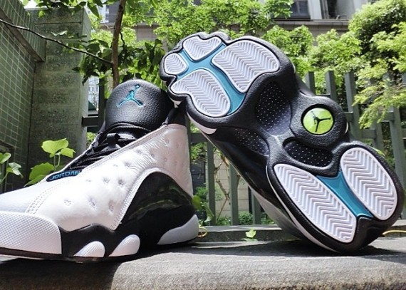

The gamma for no reason and irredescent kills these.
I dont really even like the grey toe
However the white leather on the upper looks nicer than usual.
I hate when they od on quality on beast shoes
love these.
I really don’t like that holographic material but other than that they’re cool. If Nike would change that to black suede they’d be a must have.
what the eff??? my comment got deleted!!!
I didn’t delete anything.
I swear to god chris I asked didnt mike wear these earlier this year and the next time I checked for an answer it was gone, I think someone hates me out there…lol
That comment is on the first look post of the shoe.
SoI guess Im the dummy…whew I thought I had a comment stalker or something…lol my bad. I do think he wore them though
I really like the new take. the only downside is that material wont breathe at all. not that the suede did either but still these are going to be a sauna. not a summer shoe for sure
well it is releasing in oct
LOVE IT, except the holographic material , it is overkill imo.
But still looking forward to it.
Damn. I was really looking forward to these. The 13’s were my favorite shoe to ball in back in the day. I’ve been wanting to get a new pair since the only ones I have are OG’s and I dont trust them. The hologram part sucks. I would also just have the toe solid white. The accent blue color isn’t terrible but red or even black would have looked so much better. Grey would have even worked better IMO.
Hologram!!?! Makes me wonder if Jordan brand is seeing if they truly can sell retro Jordan’s no matter how gimmicky or ugly. Huge letdown on these. The baron colorway should have been a no brainer and a must buy. Sad
Mines still look sick.
That does look like some nice leather.
not feeling the gamma accents. The hologram material isn’t too bad imo
these are good performer also !
They look like fakes
Sweeter than some maple syrup
I really really dig the 13’s most of time and though at first I wasn’t won over with the holographic (patent leather/pvc) material I think they’ll look great on court.