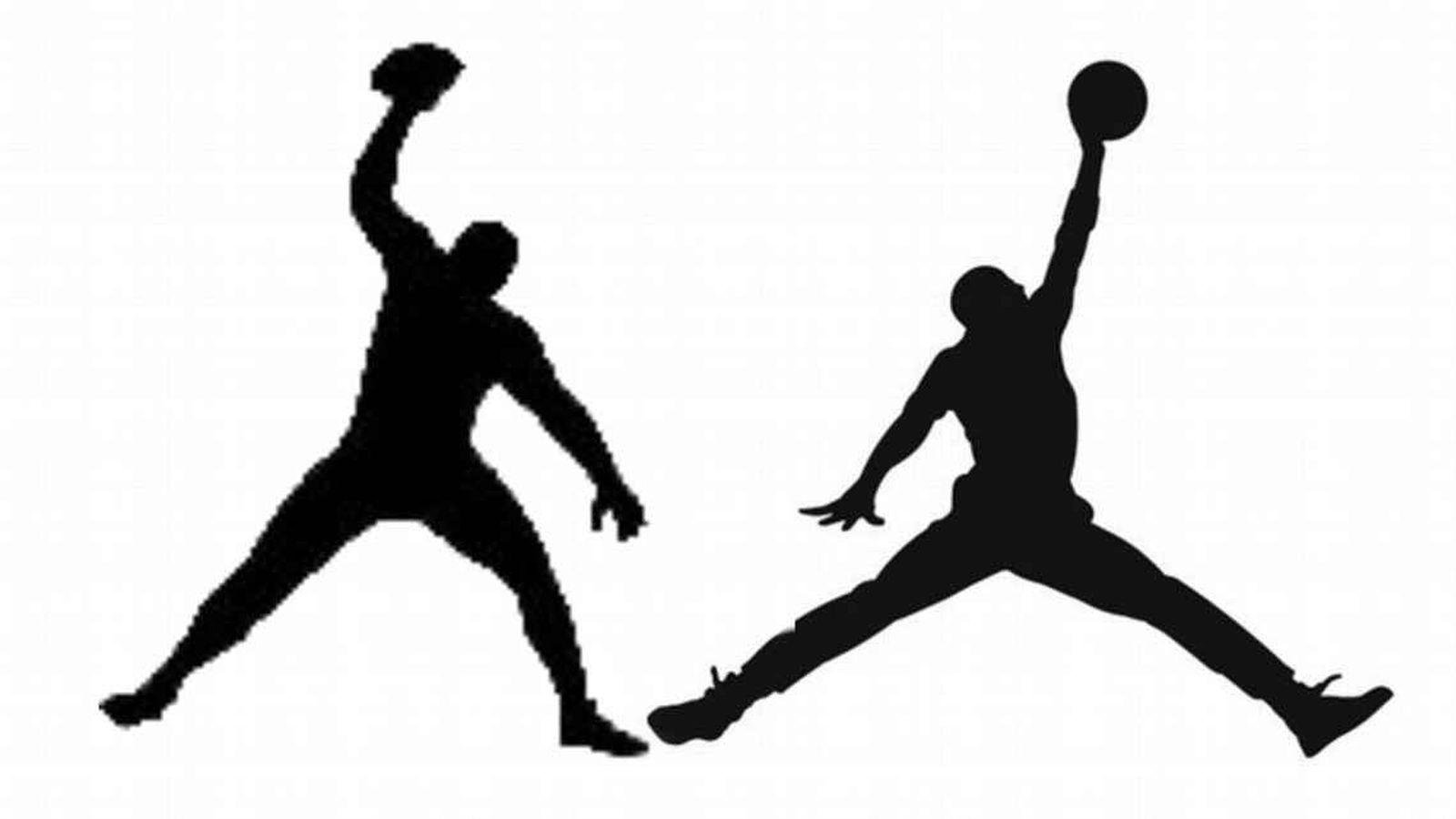
Nike believes that the logo of Rob Gronkowski’s company, Gronk Nation LLC, looks too similar to the Jumpman logo.
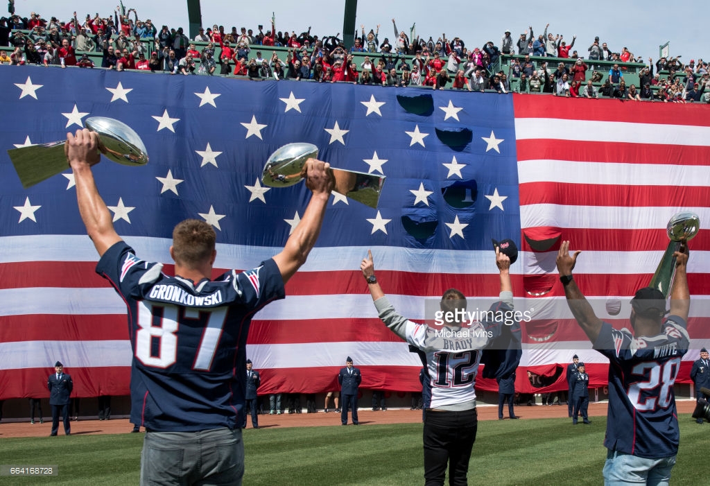
According to SGB Media, Nike has filed a formal opposition to the United States Patent and Trademark Office (USPTO) Trial & Appeal Board regarding the Gronk Nation LLC logo. Interestingly, Gronkowski, tight-end for the New England Patriots, is a Nike endorsee — he wears Nike cleats and his jersey is adorned with swooshes.
The logo in question depicts Gronkowski’s infamous “Gronk Spike” celebration move. Gronkowski’s legal team has two options: abandon the trademark or respond to Nike by August 5.
Nike could just be mad that Gronk’s silhouette looks much more brolic than the Jumpman, but who knows? Do you think the logos are too similar?

Logo image via

duhhh yes
I’m not sure Rob Gronkowski can spell “Rob Gronkowski”, so it shouldn’t be a surprise that creativity isn’t his forte and he blatantly copied another logo.
It is the shade of a fucking human being. Course it would look similar, but i don’t even think it was intentional.
If you were to go into Photoshop and flip the logo on itself, they would be basically identical
So first Nike steals the jumpman logo, and now they are sueing others for similar grievances. Nice
He’s a Nike athlete, eh? Give him a sig with that logo. I’d wear the Air Gronk.
It’s definitely too similar
It *is* too similar and Nike isn’t the only company to come hard at likeness. Apple and their patent literal round edges, Specialized going after some remote cafe named “Roubaix”….
Even if it’s their athlete, they have to like act enforcers of their brand and recognition of their logos. Imagine if they were more open to everyone adopting something similar to the Swoosh for their own companies. There’s going to mix-ups and undesired associations. Believe it or not but having likeness can draw appeal for the imitator. There were people in China who literally though Qiaodan was legitimately Jordan Brand, thus netting sales. I am anti-Apple, but although trying to patent basic elements sounds crazy, Apple’s not crazy in seeing it as a way for Samsung to simply draw appeal via similar aesthetic. You know that Polo Assn brand — the one that’s not Ralph Lauren? Yeah, people eat that up in discount stores because it almost looks the part.
I guess in short, likeness in logos or aesthetic can effectively manipulate consumers. Many consumers only react to seeing what’s on the surface — regardless if Gronk’s brand wasn’t intending for this approach.
They’re silhouettes, not logos. And if Gronk can stand like that, it’s his image, he’s free to use his image.
It does show you how ‘close enough’ words, has impoverished the American language, and it’s even bleeding through in the laws, with the old copyright law, Nike wouldn’t have a case, but with the new copyright law, there’s a lot of grey-area, because even that law uses a lot of ‘close enough’ words, rather than precisely describing the law(it’s how Robin Thicke lost Blurred Lines, not because he copied the music, or arangement, but because it had the same ‘vibe’).
Nike is ridiculous
Bullshit the rich trying to get richer
They went straight for a lawsuit? No cease and desist order first?
There are two things Nike doesn’t do, one is stay true to retro kicks and the other is F around.
They are only similar bc they are both silhouettes, I agree with nene33 but I say he should just add detail like maybe just use his likeness so it would be more like his own image, maybe just blur the face out or not, small changes like that would make their lawsuit void, and as for those idiots who say of course it’s similar, it’s not, ones a guy holding a football the other guys making a jumpshot with a basketball, the fact they are both silhouettes is only similarity