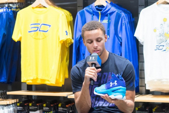
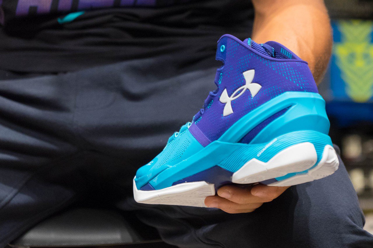
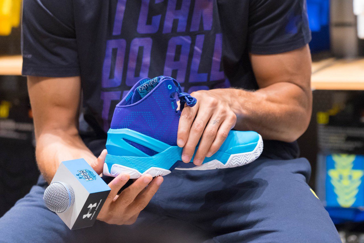
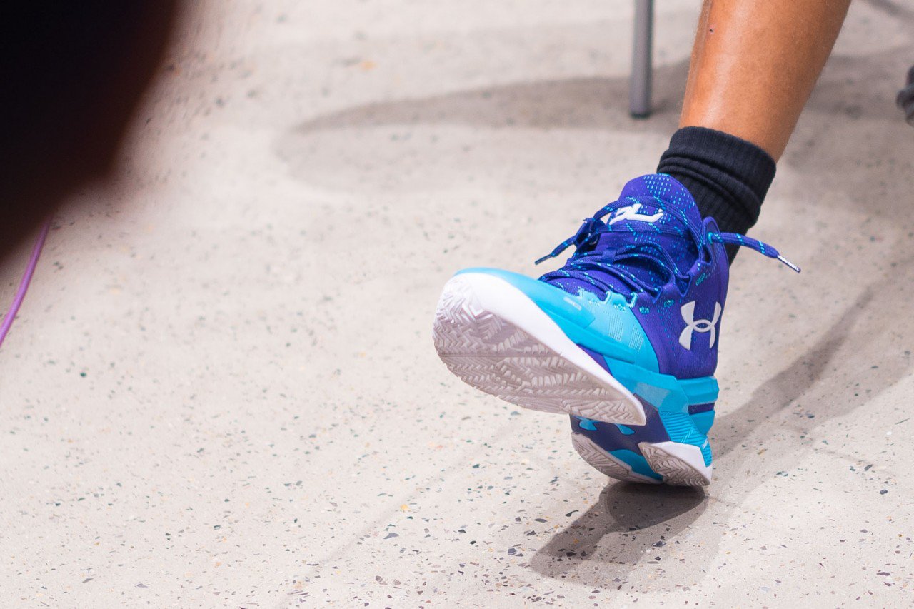
‘Father to Son’ colorway of the Curry 2? I’ll take two please.
Earlier this year the ‘Father to Son’ colorway of the Curry 1 released and it was one of the year’s best releases. The Curry 2 carries the momentum created by its predecessor with the same color scheme, although I have to say that either I’m having a hard time spotting the speckles on the midsole, or they are just not there. Whether they are or not, the Under Amour Curry 2 is one of the most anticipated on-court models for the upcoming 2015-16 NBA season, and with clean colorways as such, plan for the the Curry 2 to stay in your rotation all year long.
Let us know what you think about this colorway in the comments section below.
I might try these and 1s if I can peel the horseshoes off the side of em
Lol why?
I just hate the logo.
It’s like the nike pe department that makes rudy gay and pau gasols lazy tongue logos got to make Ua’s company identity.
It’s just so huge, ugly and uninspired.
They need a symbol that isn’t combo letters imo.
If you look at it that way, then Nike is just a simple check mark, Adidas as 3 stripes, there’s always a reason behind each logo, UA has there reason behind there logo, im curious of your definition of inspired, wanna share your idea? Or your suggested symbol?
he meant the sc 30 logo , i agree with him, i meanlook at kobe logo
well then buy the damn company, dude the guy who owns under armour, hired an artist, artisit made logo, he approves it, so become their CEO and change it, you stupid nike/jumpman fanboy
CW is so freaking fresh, i want these and the ‘homes’
is it written I CAN DO ALL THINGS in this colorway ?