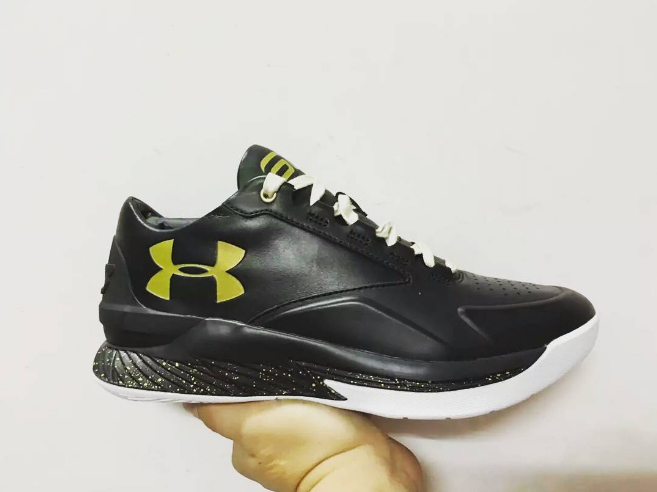
Whether you’ve asked for them or not, it looks like Under Armour is experimenting with something Nike pioneered: converting kicks for the hardwood to kicks for the red carpet.
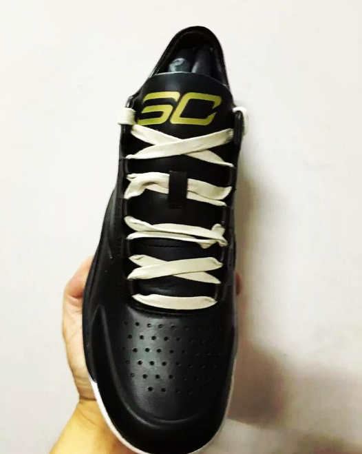
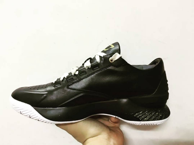
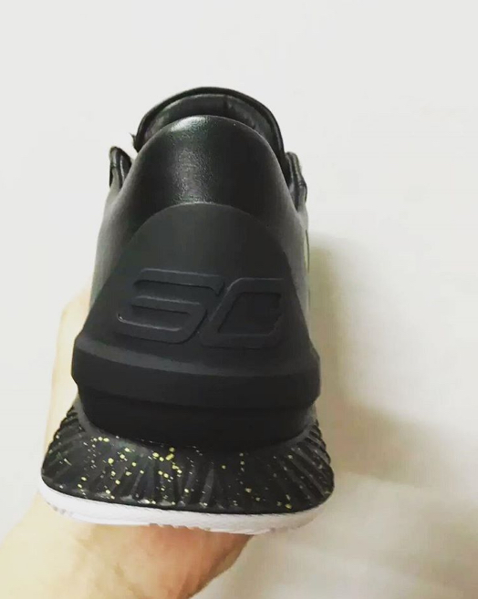
These images come from teaser extraordinaire @sneakergaga and it’ll be interesting to see which route Under Armour takes when converting its ball-hard silhouettes into lux versions. Will UA go premium leather or synthetic? What will the quality on the suede/nubuck be? Only people that have held these shoes in-hand can say.
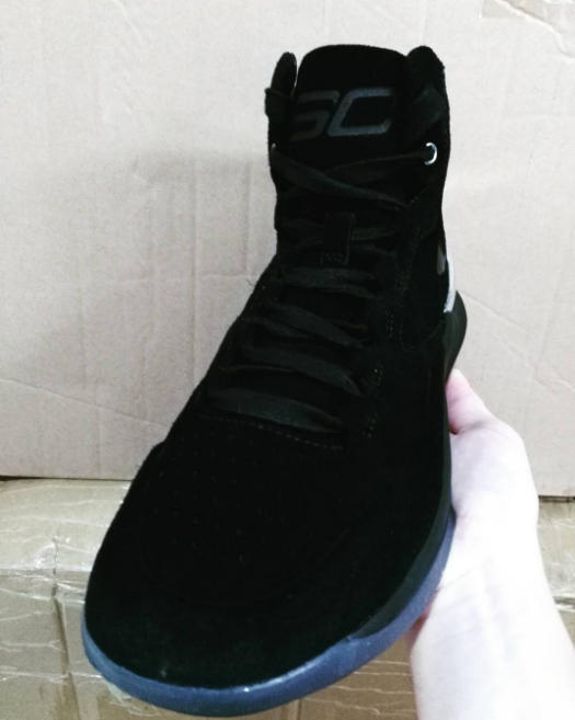
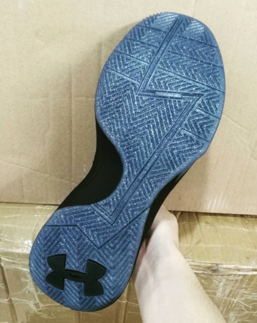
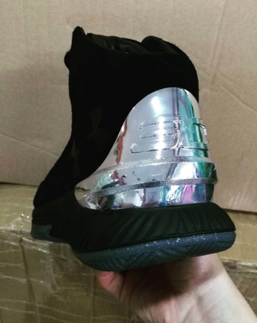
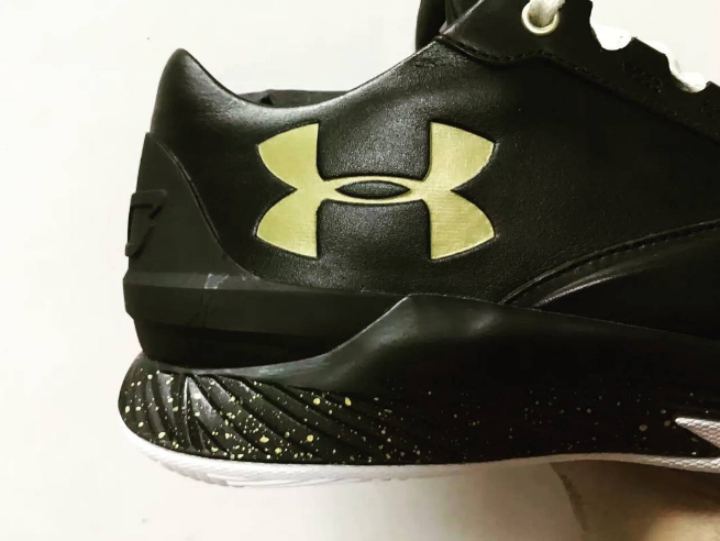
So far, these lux versions of the Curry 1 have hit both the low and the high, so we’ll keep an eye out for any Curry 2s that get the lux treatment. The Curry 1 High Lux opts for a suede/nubuck upper while the low gets leather. However, the lux versions don’t seem to be differentiating more than that — there are still splattered midsoles, faux chrome heel cups, and flecked outsoles.
There is no word on if or when UA will give these shoes the green light, but when more information becomes available we’ll be sure to update you.
Are you feeling these “high end” versions of Curry’s first sig? Share your thoughts below.
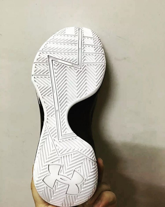

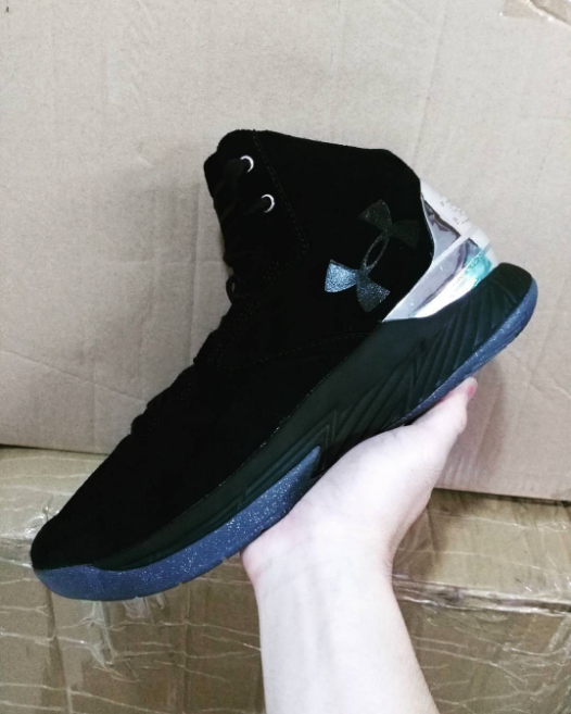
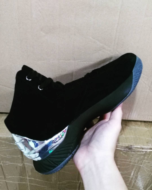
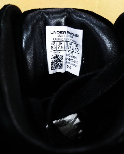
Photos via

I really hate to say it but I starting to think UA cannot make a shoe that will ever be popular off court save for those who pair them with strictly fan gear. They may have to tweak the logo or change it altogether.
Nah, the Black Ice, and Bloodline were great casual-shoes, so they CAN do it, UA is just aggressively putting their logo big, a little too big for a Lux shoe, Lux really calls for a more understated branding.
on point there with Bloodline.
The color is also just off on the low. Maybe its the lighting, but it just doesn’t look good. If they had made the logo the same as with the high then they’d be onto something.
Black Ice Low & Bloodline was fire.
The low version reminds me of the Kobe 4 Del Sols while the high version resembles the Melo M10’s with those faux chrome cups.
Really liking those Lux Lows.
The mids are sick, Id hoop in them if they are playable
If they really want to make this a luxury off court shoe, that big fat logo has to go. Maybe just put a little UA on the back above the heel cup, and thats it.
Lows look like bowling shoes.
Highs don’t look like much period. UA’s been great at their function-first approach, but trying to flex outside of that isn’t happening for me. For starters, their logo is hideous. Hopefully Curry establishes himself as a brand because his logo on the other hand is insanely good.
I like the mids.
the UA logo looks good on their football cleats, big and on the lateral toe, would like to see this with b-ball shoes