
It’s that time again – basketball season is right around the corner and although most brands have already released or at least shown us their 2016-2017 lineup, one shoe we haven’t seen is the CP3.X (save for the blurry images earlier this week). Although last year’s model was a bit of a disappointment (okay, the cushioning was BAD), the line has traditionally been a great guard shoe — fast, low riding, and old syrup sticky.
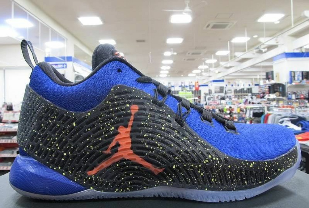
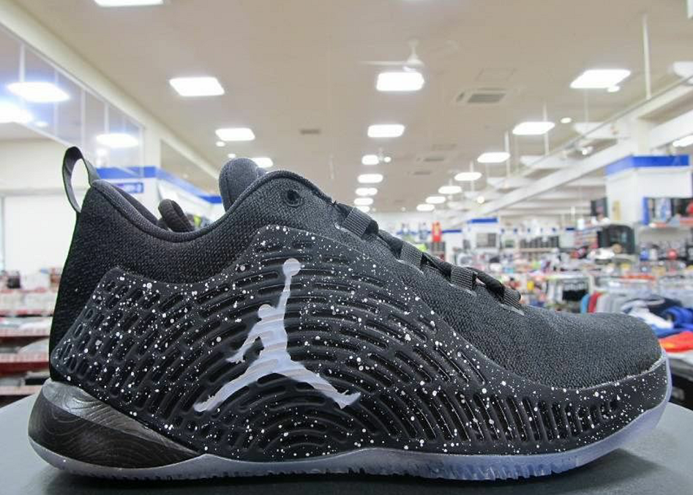
Well, as luck would have it, we get images of the CP3.X today. UPDATE: The forefoot uses the same Zoom unit as the CP3.9 with a different foam cage to hopefully improve responsiveness and containment. The traction is also completely redesigned from the 9 – looks almost like a wavebone pattern – a wavy herringbone. One thing that is noticeable is the hidden forefoot midsole — that design usually has good stability but can lead to a stiff, clunky feel.
The uppers are a performance woven toe and forefoot with a direct inject TPU heel cage/wrap. Could be great for stability, making those hard CP3 cuts and changes of direction easier.
Retail will be $125 when the October release date arrives. As always, stay tuned right here. If you like the look or have experience with the CP3 line, drop knowledge below.
Jordan Brand CP3.X
Release: October 2016
Retail Price: $125
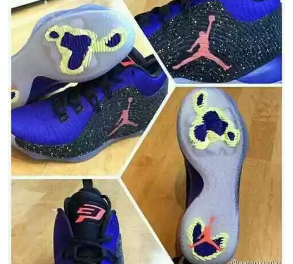
Below is the kids (GS) version
Images via

I hope that they perform well for those who will get them because I do not think that they will be purchased for looks.
One word: hideous.
RIP CP3’s. Haven’t bought a cp shoe in a long time.
I actually like them- at least something different for once. Looks like the toebox is taken from xx9s
I don’t think they look bad too, I just think they’ll perform bad.
One of the greatest point guards since the new Millennium and he gets these. Oh well, will wait for the playoff version
It’s like they had a ton of left over uppers from the 29 lows so they slapped a tpu cage on these things and called it a day.
And no, I’m not hating on them just because they are “not retros” but rather the design itself look so uninspired. These may be a perforance shoe but the 90’s were where it was at design wise.
Well, that’s kind of the retro-point, you forgotten the repetitive, and redundant 90s designs, and only think of the best designs looking back, there were many ‘improvised designs'(combination takedown/team versions) in the 90s too though, and they were just like they are today, in 25 years you’ll have forgotten most of the repetitive, and redundant designs and you’ll think that 2040 is uninspired, and 2015/2016 had all the great looks.
I would have to disagree. I feel that what really appeals to me about the designs back then is that they used real materials and none of these plastic non-sense we get nowadays. It’s all about prferrence I know but man I miss those days, and the shoes did not play half bad too.
Looks like they took an outsole and slapped it on the side. Like a Kyrie 2^2 for when you want traction when you’re literally lying on the ground.
now it would be really akward if they found out that the side “outsole” had better traction lol
Probably JB has run out of ideas. It’s more like a Jordan Trainer.
Honestly the pod cushioning was the bomb on the old cp3’s
Now that’s just hurting my feelings, printing a pressure-map on the sole, only to do nothing with it…… 😡
The wing looks a little awkward with the Jumpman that big, and just somewhere near the middle, it should’ve been small, metallic, and nearer to the heel.
Is Jordan trying to make the CP3s ugly on purpose? I don’t remember if any one of them looked good, but the last few years were hideous. Anyway, for performance, if that articulated midsole didn’t work on last year’s CP3 and the Ultrafly, then I don’t have much faith in it magically working this year. At least top load it or something.
gradient dual
LOLLOL
i remember the time when jordan’s looked better than anything else because the design was thoughtful/purposeful and with small branding, making the design itself stand out.
today, i think they’ve lost their way with their predisposition to slap huge branding on all their shoes. imho, it seems like such an insecure move for such a “mature brand”. makes you think they are trying to make up for bad/uninspired design/tech by simply putting on a huge iconic badge hoping people will look beyond the flaws/laziness/bs
The outsole like the copy from Peak TP9.
JB runout of idea?